If you like having compact sensor tiles that still explain what the numbers mean, this card is for you. The Sensor Legend card shows a numeric value (e.g. CO₂, PM2.5, VOC, temperature) and, on hover, displays a legend tooltip with colored ranges and descriptions.
Lovelace type: custom:sensor-legend-card 🎯
✨ What this card does
The Sensor Legend card:
- Shows a single sensor value in a compact tile.
- Lets you define legend items (rows in a tooltip):
- Text description (e.g.
≤1000 ppm) - Color dot (e.g. green / yellow / red)
- Optional numeric Min/Max range
- Text description (e.g.
- Automatically colors the main value based on the range it falls into.
- Supports tap actions (card tap + icon tap):
- More-info dialog
- Toggle entity
- Navigate
- Open URL
- Do nothing
- Can use default entity icon, a custom icon, or hide the icon completely.
This is ideal for air quality panels, energy dashboards, or any place where you want a quick value + clear context.
📦 Installation via HACS
The easiest way to install the card is through HACS.
- Make sure you have HACS installed in your Home Assistant.
- In HACS, go to Frontend → Custom repositories.
- Add repository:
- URL:
https://github.com/VahaC/HA-Sensor-legend-card - Type:
Dashboard
- URL:
- After adding, find Sensor Legend card in HACS Frontend and install it.
- Restart Home Assistant.
- In Settings → Dashboards → Resources, make sure the resource is added (HACS usually does this automatically).
Repository: https://github.com/VahaC/HA-Sensor-legend-card
🧩 Adding the card to your dashboard
Once installed, you can add the card via the UI editor.
- Open your dashboard and click ⋮ → Edit dashboard.
- Click ➕ Add card.
- Choose Custom: Sensor Legend card (via card picker).
- Select the main sensor entity.
- Configure appearance and legend items.
The configuration dialog looks like this:
On the right, you immediately see a live preview of your tile.
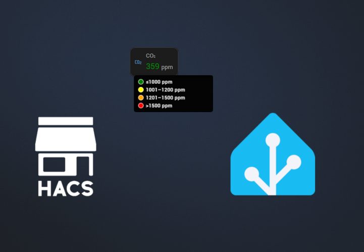
⚙️ Basic YAML example (CO₂ sensor)
Here’s an example configuration for a CO₂ sensor:
type: custom:sensor-legend-card
decimals: 0
entity: sensor.living_air_sensor_co2
legend_items:
  - text: ≤1000 ppm
    color: green
    max: 1000
  - text: 1001–1200 ppm
    color: yellow
    min: 1001
    max: 1200
  - text: 1201–1500 ppm
    color: orange
    min: 1201
    max: 1500
  - text: ">1500 ppm"
    color: red
    min: 1501
grid_options:
  columns: 3
  rows: 1
name: CO₂
tap_action:
  action: more-info
icon: ""
icon_tap_action:
  action: more-info
What this does:
- Shows the current CO₂ value with 0 decimal places and
ppmunit. - Changes the value color based on which range the number falls into.
- On hover, shows a tooltip with a colored legend:
🧱 Understanding legend items
Each legend_items entry can contain:
text(string, required) – text shown in the tooltip next to the color dot.color(string, optional) – CSS color/hex used for the legend dot and optionally for the numeric value.min(number, optional) – lower bound of the range.max(number, optional) – upper bound of the range.
How ranges work:
- Both
minandmaxspecified → inclusive range[min, max]. - Only
minspecified → matchesvalue ≥ min. - Only
maxspecified → matchesvalue ≤ max. - The first matching legend item (top to bottom) determines the value color.
If no legend matches, the value uses the default text color.
🎨 Icon handling
The card supports flexible icon logic:
- Custom icon via
iconin the card config. - If
iconis not set, the card uses the entity’s own icon fromattributes.icon. - If there’s no entity icon, the card falls back to domain / device_class presets.
- If you set
icon: none, the icon is hidden completely and does not take space.
Example:
type: custom:sensor-legend-card
entity: sensor.living_air_sensor_formaldehyd
name: Formaldehyd
icon: mdi:bottle-tonic-skull
Or to hide the icon completely:
icon: none👆 Tap behavior & icon tap behavior
The card lets you configure two independent interaction behaviors:
- Tap behavior – what happens when you click the card.
- Icon tap behavior – what happens when you click the icon.
Both use the same action types:
more-info– open standard Home Assistant more-info dialog (default).toggle– toggle the entity (useful for switches, lights, etc.).navigate– navigate to another Lovelace view.url– open an external URL.none– do nothing.
YAML example with actions
type: custom:sensor-legend-card
entity: sensor.living_air_sensor_co2
name: CO₂

# Click on the card → open more-info
tap_action:
  action: more-info

# Click on the icon → go to detailed air quality view
icon_tap_action:
  action: navigate
  navigation_path: /lovelace/air-quality
In the visual editor, these are available in the Interactions section as two dropdowns:
- Tap behavior
- Icon tap behavior
🎛️ Appearance section (Name, Icon, Decimals, Unit)
The Appearance expansion panel lets you tweak how the card looks:
- Name – override entity friendly name.
- Icon – override entity icon, or type
noneto hide it. - Decimals – how many decimal places to show (e.g.
0for359 ppm,1for21.5 °C). - Unit – override unit label (
ppm,ppb,µg/m³,%, etc.).
These are completely optional – you can leave everything as default and just select the entity and legend items.
🌬️ Real-world example: air quality strip
This card really shines when you build an air quality strip of multiple pollutants:
- CO₂
- PM2.5
- VOC
- Formaldehyde
Each card can have its own legend, colors and ranges, while maintaining a consistent compact layout.
You end up with something like this:


Hovering any tile immediately shows what is considered good/medium/bad for that metric.
🛠️ Tips & tricks
- You can use CSS color names (
green,red,orange) or hex codes (#00ff00). - You don’t need to define both
minandmaxfor all items – e.g. last item can be justmin: 1501. - If multiple ranges could match, only the first match from the top is used – so order your legend items accordingly.
- Works great inside Masonry / Grid / Horizontal stack cards.
- Perfect companion to history graphs – the legend explains thresholds, the graph shows trends.
🔚 Summary
The Sensor Legend card is a small but powerful way to make your numeric sensors in Home Assistant self-explanatory:
- clear numeric value
- color-coded thresholds
- hover legend for context
- flexible interactions and icon behavior
Install it via HACS, add a few legend items, and your dashboards will become much more readable – especially for guests and family members who don’t remember what 1200 ppm CO₂ actually means. 😄
👉 Source code & releases: https://github.com/VahaC/HA-Sensor-legend-card
Leave a Reply